Cannot get hamburger menu on mobile

I cannot get the hamburger menu to appear on mobile.

The logo disappears and a search bar appears to the right of a menu bar that I have never seen before.

How can I get the hamburger menu to appear on mobile?

Also, how can I get the headline elements to respond correctly? The text is wrapping in the middle of words and seems to be doubled spaced when it wraps. All mobile issues.

Hi There,

I can see you are using X and not Pro. On X, that is build in on the template. Possible reason you can see it is because it is the same color with the background. It blends. Or there might be a customization that removes it. Your site is under construction so I can’t confirm the cause. Please do share credentials inside a secure note so we can check:

Alternatively, you can inspect the element why it is missing. Here’s some guide:

Hello @brianmclegal,

Thanks for updating in!

I have checked your site and I am seeing the mobile menu. I can even toggle it to display the menu items.

Mobile menu collapsed:

Mobile menu expanded:

Please keep in mind that since you have installed a caching plugin WP Super Cache, please clear your plugin cache and regenerate the minified JS/CSS files before testing your site. This can cause the changes to not take place on the front end. It will eventually show up when the cache regenerates, but it’s not ideal if you’re looking to see your changes immediately. Caching plugins are best to turn on only when you’ve finished building the site.

Please let us know how it goes.

This is not how it appears on any iphone I tested. I don’t think the pictures you provided were screenshots from an iphone.

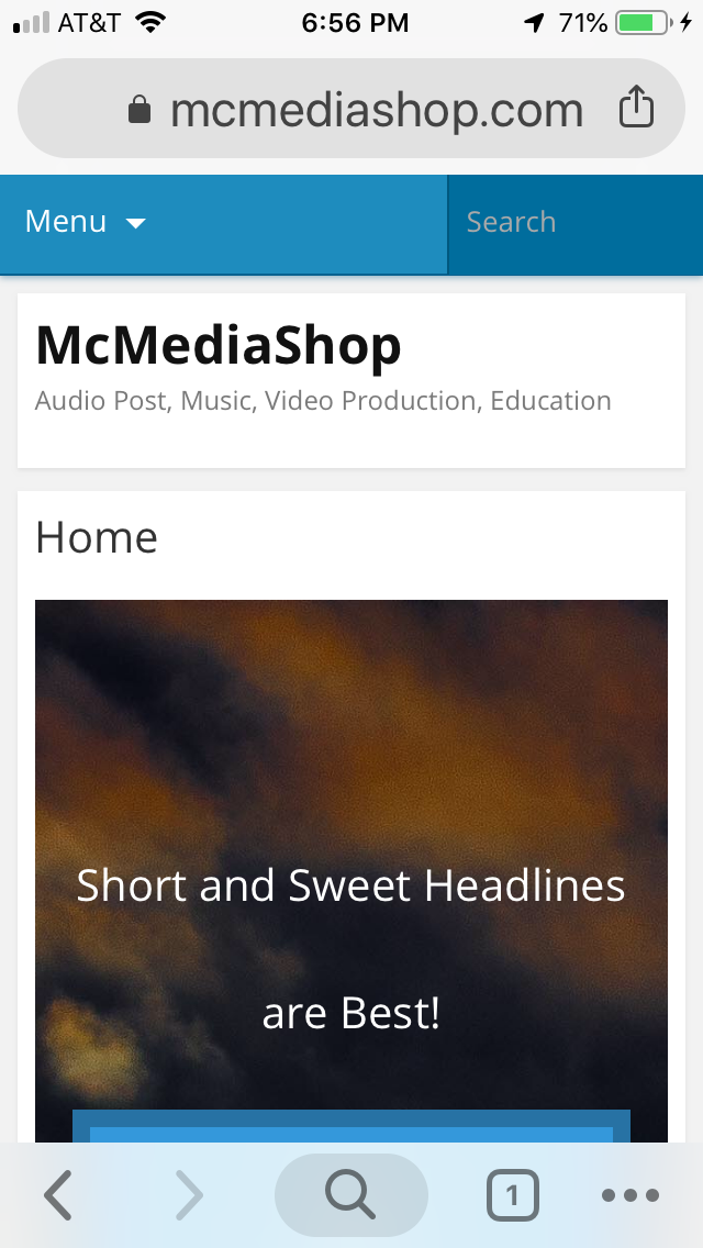
  1. When it first loads there is a blue bar in the upper left that says “menu”. To the right of that is a blue search bar.

  2. The page title also appears on the page, which I have specifically turned off, yet it appears on the ios version.

  3. The Headline text at the top is not formatted correctly and it has a huge space as it wraps.

  4. The text is also wrapped mid-word at the bottom.

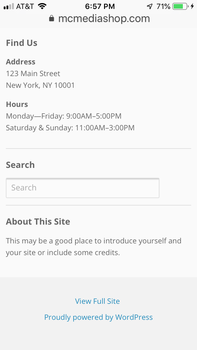
  5. In addition, there appears to be some kind of “footer area” I have no idea what this is or where it came from since it is does not appear in cornerstone or on the desktop site. What is this and where does it come from?

  6. At the very bottom, it says “View Full Site”. What is this? When I tap it, I get the mobile version that looks like the cornerstone site and similar to what you posted above.

  7. beneath item #6 is “Proudly powered by WordPress” again, why would I want this on my page. Where did it come from?

  8. None of my envira galleries display on mobile.

I don’t understand why the mobile version is COMPLETELY DIFFERENT from Cornerstone. I have looked for documentation for why there are two different versions of the site and all I can find is “how to hide elements” for different screen sizes and the viewing options in Cornerstone. Please provide link to documentation if there is any.

I also have to say, I have been very disappointed in x theme as a product. If x theme was designed for developers and code fluent users,that’s fine, but I wish that was made clear upfront. I have spent a great deal of time over the last few weeks trying to get a simple website up and running, but I cannot even get my galleries and menus to appear correctly on the most popular format, iphone. With all the overlapping terminology and menu locations, I think the developers left people like me way behind. Maybe that’s where we belong, but I never would have gone this route had I known that x theme and cornerstone is neither intuitive nor user-friendly.

Hello @brianmclegal,

Thank you for the clarifications and your screenshot. I understand your frustrations. All of this mobile issue is not related to the theme itself. Now, I know why you are having this issue. This is all because you have installed Jetpack plugin and Mobile Theme module is enabled. Please go to Jetpack -> Settings -> Writing tab and disable the Mobile Theme feature.

For more details:

Hope this helps. Kindly let us know.

Wow! I would not have found that in a million years. I was about to call Wix! It seems to have fixed the menu issue.

Thank you.

Any ideas why my envira galleries are not displaying properly? I have provided screen shots. I have three pages with nothing but a single envira gallery. I’ve been through the configurations but don’t see anything that applies. I’m sure I’m missing something. Page is set to no container, header/footer.

These issues are on both mobile and desktop.

If there’s a better way to make simple galleries, I’m open to it, but this came with x theme and it touted as “the best”. Please advise!

the first time they load, the images appear as above, when the browser is refreshed, they appear normal (but cropped).

I do not understand why the pictures do not maintain their aspect ratio and why there is a field to enter the image size. Won’t they resize according to screen size? On mobile, the images appear long, short, and cropped.

Hi @brianmclegal,

​To assist you better with the Envira Gallery issue, would you mind providing us the url of your site with login credentials so we can take a closer look? This is to ensure that we can provide you with a tailored answer to your situation.

To do this, you can create a secure note with the following info:
– Link to your site
– WordPress Admin username / password

To know how to create a secure note, please check this out: https://theme.co/apex/forum/t/how-to-get-support/288

Thank you.

This topic was automatically closed 10 days after the last reply. New replies are no longer allowed.