Howdy @core365,
Thanks for writing in and I’ll be happy to run you through the Size & Position controls for the image layers when utilizing advanced backgrounds.
The Size and Position inputs for this control grouping correspond to the CSS properties background-size and background-position respectively. Make sure to click on those links to visit a fantastic CSS reference that will include much more information on those properties for you to review if needed.
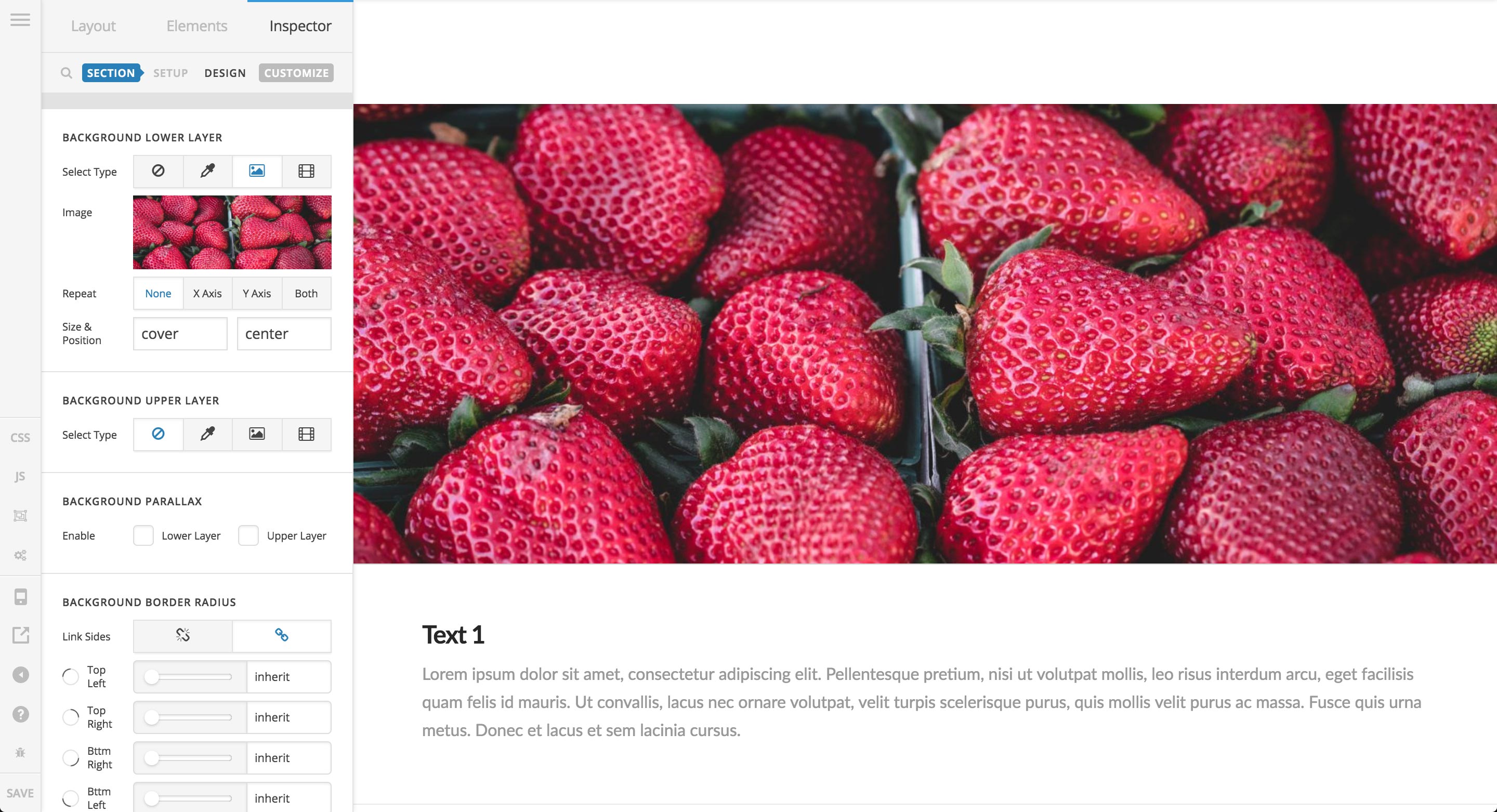
Out of the box, these inputs are set to cover and center respectively, which will provide you with a full-sized background image that will cover the entire area you are working on (sometimes called a “hero image”). This is typically one of the more common ways in which people tend to utilize background images, so it is a sensible default for the majority of users. It will yield the following result:
For a situation like you’ve described where you have an image you’d like to position down in the bottom right corner of the Section you’re working on, let’s walk through that step-by-step now. First, we will swap out our previous background image with our intended graphic. For this example I’ll be using a styled “23” that we’ve used in some other demo videos. Changing out the image will result in the following:
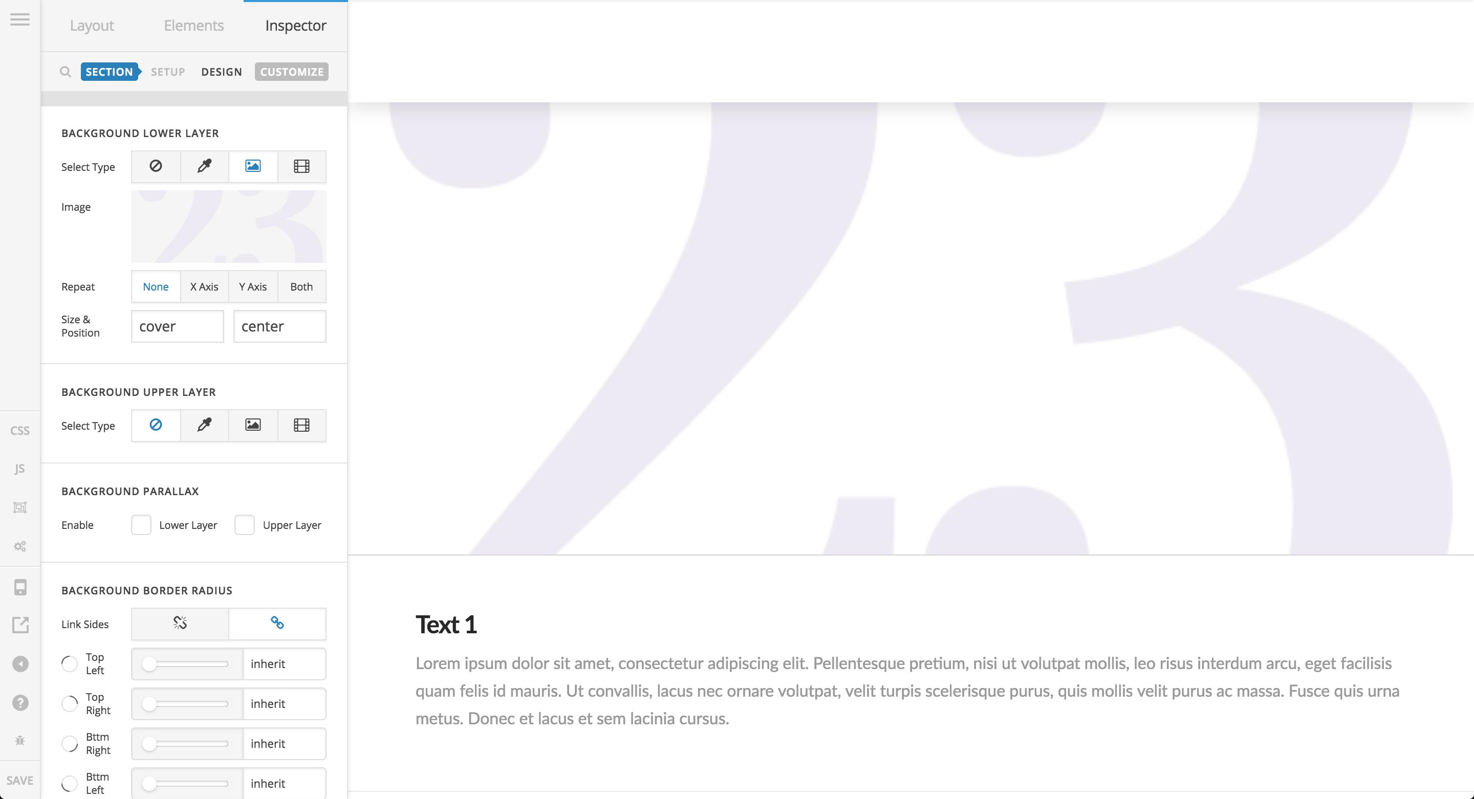
Note that since we haven’t adjusted any of our Size or Position parameters, our small graphic is still covering all the available space of the background. The first thing I would do is adjust the Size parameter to get my image sized appropriately:
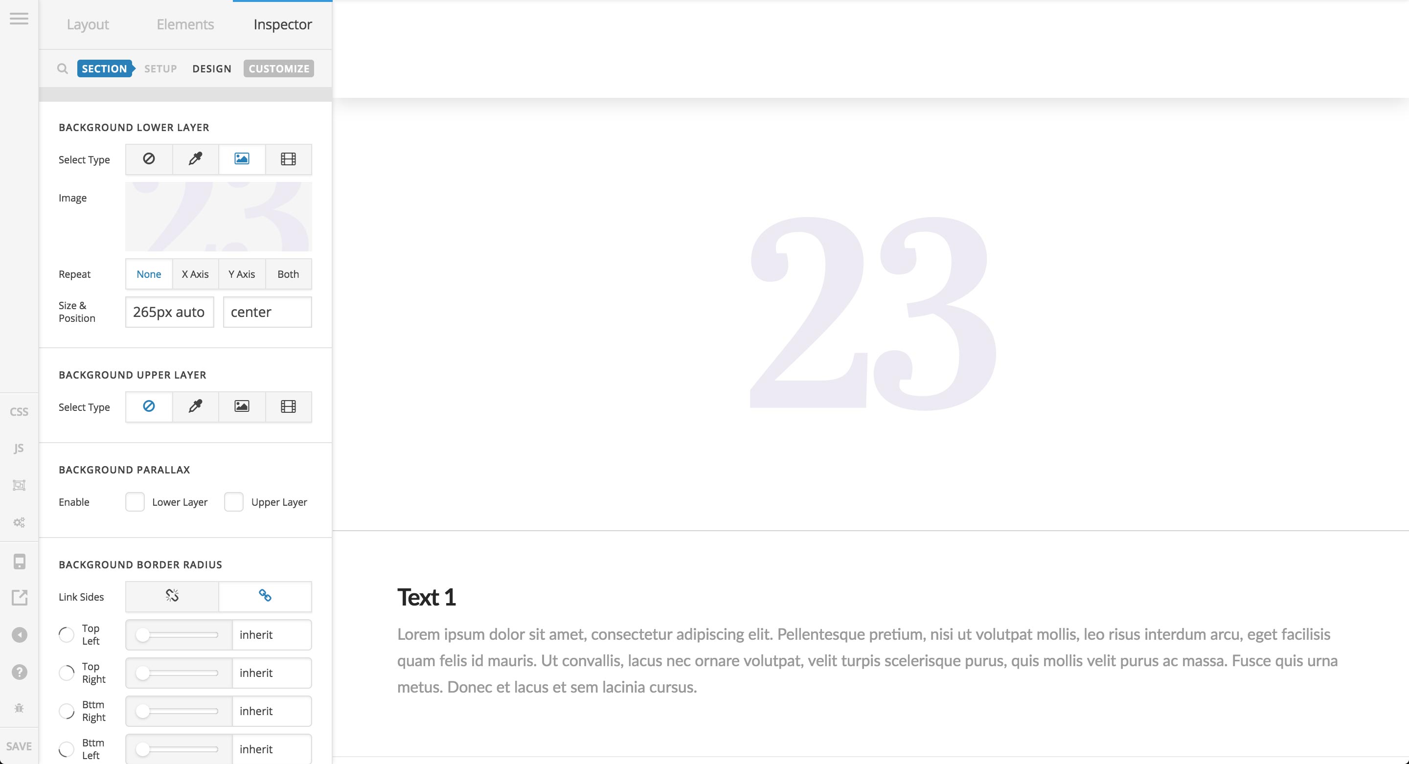
Remember, the background-size CSS property can take certain keywords like cover or contain, but it can also specify a specific image size using values such as px, em, %, et cetera. If inputting a specific size, if only one value is present, that value will be utilized for both horizontal and vertical sizing. For example, inputting 100px would mean the background image would be sized to 100px wide and 100px tall.
The value I’ve input of 265px auto is specifying both a width and a height. This says that the image should be 265px wide, and the height should auto size based off that. The reason I’ve picked 265px wide is because the image is 530px wide originally, so we divide it by half to ensure that it shows up appropriately on devices with high pixel density. The auto just makes things a little simpler without having to input the specific height needed.
Next, we’ll adjust the Position input. Similar to Size, there are keyword values that can be accepted such as top, left, right, bottom, and center, or we can use specific values to position our image exactly as we want. Also similar to Size, we can input one value that will be applied to the both horizontal and vertical position, or we can specify each axis independently. First, let’s see what using a keyword value will do:
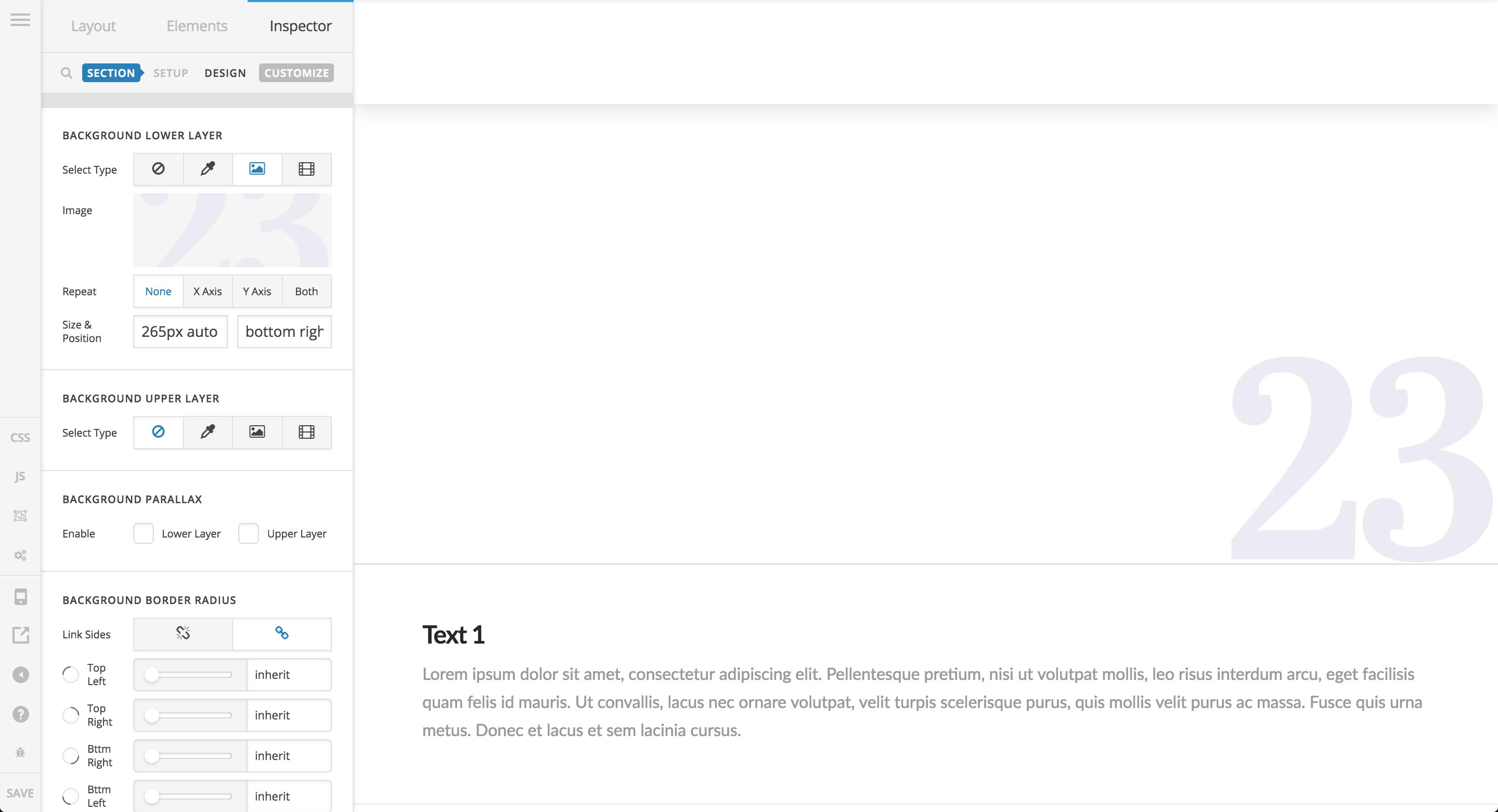
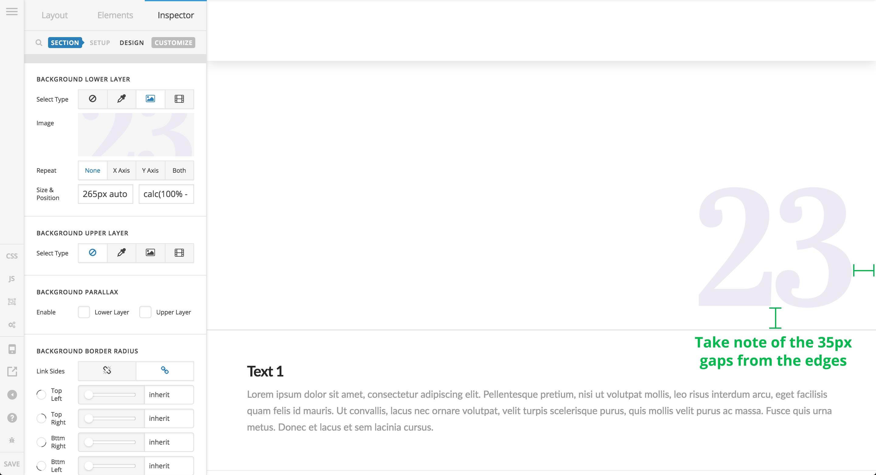
Using the keywords bottom right together, we have positioned our image in the intended area. That being said, this this may not be the exact desired positioning, as you may wish to have it offset from the side a bit. To do that, we’ll have to switch to using % values along with the CSS calc() function to perform a little positioning magic. 
To achieve the same positioning using % values, you could input 100% 100% instead of bottom right. You can think of % values for background-position as a scale, where you can place your image anywhere along those lines both horizontally and vertically, with 0% being the start and 100% being the end. You could easily achieve an “inset” look by using something like 90% 90%, but keep in mind that the background image will move as your screen is sized up and down using this, since these percentage values will always be changing relative to the size of the container. If you want to keep a consistent spacing away from the edge of the background—say 35px—you would need to use calc(), which allows us to perform math operations by combining units. For this example, we would input calc(100% - 35px) calc(100% - 35px), which is instructing the image to be positioned 100% along both horizontal and vertical axes, but then subtracting 35px away from that original position. The end result would look like the following:
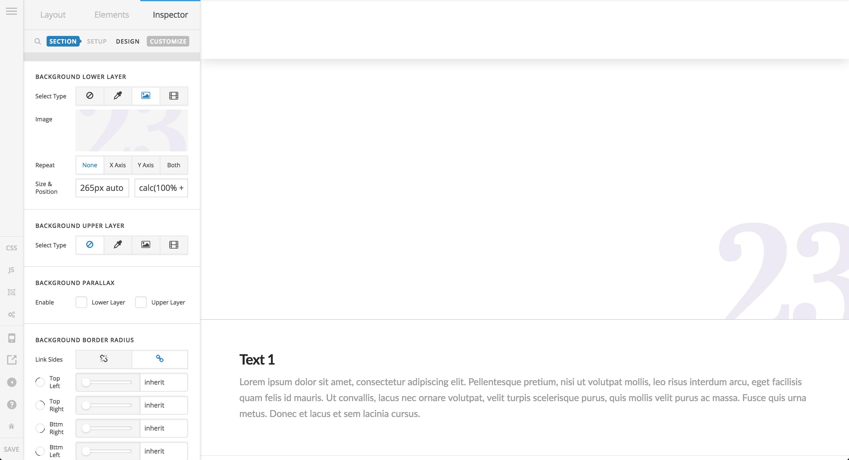
We can also use calc() to add some extra spacing. For example, let’s say you wanted your background image to always overlap the edge of the Section by 35px, you would use calc(100% + 35px) calc(100% + 35px) instead, where you are adding the px value to the % value, which would result in the following:
Armed with this, you can effortlessly position background images anywhere along the spectrum of size for the element you’re working in, and even make pixel-perfect adjustments utilizing calc() if needed.
Hopefully that helps to point you in the right direction.
Cheers!


