Background image responsive

Hello Theme x Community.

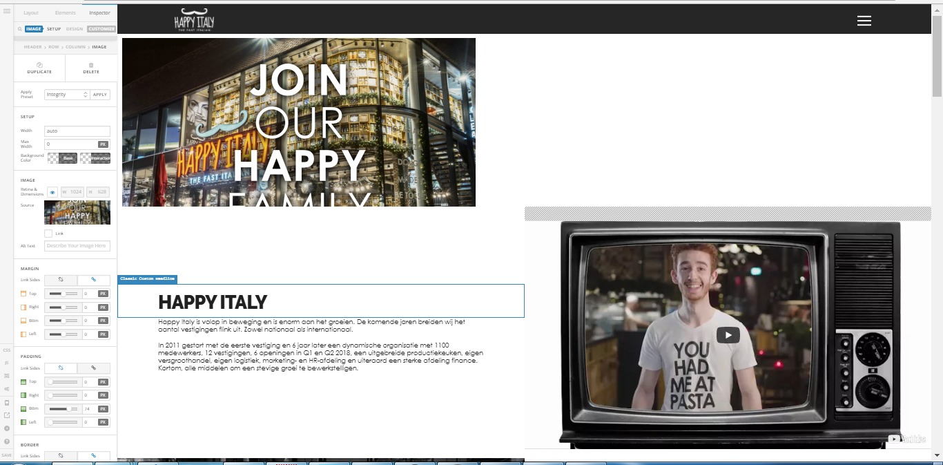
I have an image, in fact:

Unfortunately, I have not managed to get this responsive.
The idea is that the picture and the text in the picture should be aligned exactly in the middle.

See this movie below. He is not showing it well on a screen of 2000px wide. and as a mobile phone also not quite good.

Do you know a solution how I can remedy this? and that the picture is displayed in theme x Pro both on desktop and mobile?

I hope you can help me.

PS: this are my settings: https://i.gyazo.com/72f2dc58e7ae19baf1a52b0d37a7aa46.png

Hey @SoZeker,

Regretfully, we could not give a specific solution without seeing your setup. Please give us the URL where you’re having this issue and access to your WordPress admin in a Secure Note.

For the meantime, please see this tutorial on how to make your slider responsive.

Thanks.

Hi there bro

This is the URL :

http://www.happyfranchise.nl/demo-19/

You need to disable the Retina & Dimensions setting so it will use the native size. If you need that enabled, your image must be double the current size of your image.

The image is cut off by your section’s height using this code.

You need to remove that.

Thanks.

1 Like

Oke Christian,

How you mean ‘double’ the images size?
The image size right now is

width: 2048px
height: 1256px

you mean this above x 2
like
width: 4096p
height: 2512px

Please help me out.

Kind regards,

Hi there,

That size should be fine now, it’s doubled the size of retina tablet. But if you wish to support desktop and laptop’s retina display, then 4096 is good too. But it will be bigger and slower.

Do other issues are now solved like the clipping?

Thanks!

This topic was automatically closed 10 days after the last reply. New replies are no longer allowed.