I set a background image in Section 1 on the home page. The problem is that in mobile devices the image stretches, it
does not remain fixed. Any solutions ? www.djbobcarpenter.com Section 1 below the header.
Hi Bob,
That is actually normal is you set the background size setting to cover. It would be quite tricky to use a fixed image for all screen sized as it will automatically scale to the size of its container.

There is another background size value which is contain but the result of that will look like this:
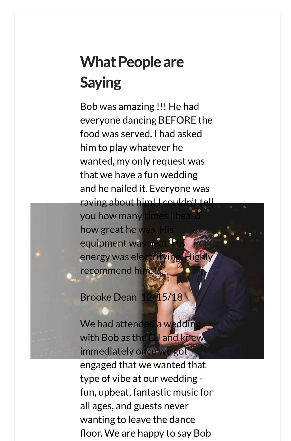
What will you have to do for this is to decide and use an image that is practical to use regardless of the device width.
Hope this explains.
If you look at this site https://www.djtaso.com in his first section, he has a background image. This is what I’m trying to do with this concept.
I was able to fix the background image for all devices by forcing the image to the left, instead of center.
However, now I’m trying to get the text to stay over the left. Is there any CSS that I can float the 1 column over to the left and fix the overall size of the column. I tried this using this on the text customization Element CSS and it did not work. float:left; width: 5%;
I was getting around this by using 2 columns but when on some smaller devices the second column floats beneath the first one taking up space.
I found the solution by going into the texts element inspector and adjusting the percentage of the column size.
We’re glad you managed to do it on your own.
Cheers!
This topic was automatically closed 10 days after the last reply. New replies are no longer allowed.